Monday 29 April 2013

29.04.13 Hash Pipes. Yeah...

Spent the last while looking up dirty glass to try and replicate the stained effect you can see inside a hashpipe.


Went a bit mad with the bump mapping link to the png texture I made and added it to a layered shader to create this effect. The glass looks too much like chipped ice, and the dirt stain is too reflective and looks like its part of the glasses own colouring rather than a stain ingrained onto it.


Decreased the bump map value and increased the reflections and refractions on the blinn material shader to make it look more like glass and less like chipped ice. Still having the same issue with the stain.


Realised that the yellowing smoke stains on the glass would actually discolour it and be on the inside of the glass anyway, so it can in fact be reflective. The bump values are increased on the above image to make the glass look a bit tattered.


Finally applied the shader material to the hashpipe geometry. It looks a bit strange due to the extrusions and the nature of the shape. The UV placement map might also need a few adjustments to sort out the streaking effect. A few more tweaks and the lighting set up in the scene should sort this out.

Not too bad, needs some tweaking to make the dirt look a bit clearer but as it'll be vewied from further away anyway I think this will do for now.


Thursday 25 April 2013

25.04.13 - More textures...

More texture updates. Got a repeating tile texture for the carpet, but the bump map on it makes it look a bit distorted and weird, will need to sort that out when maya stops crashing due to massive texture files :|


Decided that if you're an impoverished drug user, you're probably going to be relying on supermarket own brand food. So I came up with a really simple, basic, cheap looking packaging texture for some own brand "corn flakes." Going to keep this packaging texture design template for the rest of any food tins or packets to maintain consistency and continuity.


Textured the bin, more spillages down the plastic to make it look grotty. Got a bin bag texture inside the bin, need to fill the bin up with more assets and have a few full bin bags sitting around the flat to emulate the theme of neglect.   


Got a procedural 3D texture on the sink and taps to simulate rust and dirt. The mass of dirty plates are to again suggest the idea of neglect and poverty, maybe he can't pay his water bills so can't wash them. Or maybe he's just too stoned all the time to care how dirty his dishes are.


Got a few more assets on to the table. Some tobacco, and an ashtray full of cigarette butts and a load of ash. The weird grey cylindrical object with spikes is a hash grinder. Spending a day Googling drug paraphernalia in white space definitely gets you some weird looks. The beer bottle texture needs some work as it's a bit too transparent, the glass needs to be darker. Keeping the "economy" design going with the beer bottle label.       


Monday 22 April 2013

22.04.13 Texture progress

Carrying on texturing the depression/poverty/drug abuse scene. Got on to doing the kitchen area.


The cooker faceplate took me a while to do because the numbers around the dials were pixelated horribly when rendered out, so I separated it from the main mesh and applied a new texture at a higher resolution  rather than having it stretch accross the whole cooker object which just looked horrible. I also created a vector flame graphic for the gass switch button, I don't think you'll really see it clearly in the final renders but it's there just for continuity. Needed the faceplace and cooker to look like all the dirt and grime was cooked on, or ingrained into it, so I created a bump map and played around with the settings until I was happy with how grimy it looked. The cooker handle I figured would not only be grimy but also a bit rusty due to all the spillages and various other bacteria corroding away at the metal over time. This is a 3D procedural texture.


Finally the walls are whitewashed with some yellowed dirt near the ceiling to suggest that they have been stained by excessive smoking.


The walls were looking a bit too "bright white" to really show off the amount of dirt that would have accumulated on them, so I made them a bit duller and a bit more yellow to show off how dingy they really are.


Wednesday 17 April 2013

17.04.13 - Texturing the Druggie Bedsit

So hit a bit of a block with the Happy / Content couple scene and just couldn't even really deal with looking at it any more because it was just making me go askdasldjaskdljdskfjk, or in other words, "no."

So been UV mapping and texturing parts of the junkie flat scenario.
Here are a couple of screengrabs of what I've got so far.


Making dirty textures is actually surprisingly fun. I felt like a kit with a paintbrush just firing globs of paint everywhere. Then I realised I can't just do that because the stains and dirt on the surfaces have to look like they have gotten there progressively over time, and not just the result of the drug abuser going on a mad trip when he's out of it and throwing muck everywhere, though I guess using drugs could make you do that? I don't know, never had the experience myself and I really don't want to. I think going that far would be way beyond the boundaries of practice based research. So I started to think about how stains and spillages would get there in the first place, and think about what substances and objects would cause which sort of stains and patterns. Obvious ones like tea/coffee/juice stains and spillages were easy enough, and other things like little decals where food has spilled and dried in to the fabric due to it not being washed.
I also included a dirty blanket as the character's duvet, but after creating the mattress texture I found I liked this better and I think it stands out more amoung all the other browns and yellows of the sofa and the table, and looks better aesthetically. 


Started making some high res bump maps for the sofa, which is killing my maya scene when I put it on the high quality viewer, so I'm going to seperate everything with high res textures/bump/specular maps into different render layers so maya doesn't die when I attempt to move and rotate around my scene.


Also the mug in the above image is wayyy too shiny and reflective and this is because when I exported the cut as a .fbx with the blinn texture I set up, maya inexplicably changed this to a phong texture upon import into a new scene. I don't even know. So I went ahead and copied down the material settings for the cup so I could change it once it's imported into a new scene.


Obviously the lighting needs work, this is in no way the proper lighting for the scene, this is just so I can see how the various textures and maps are interacting with the light.


Thursday 11 April 2013

11.04.13 - Happy / Content Scene

To contrast with the darker themes of the Nursery scenes and the Drug Dependency scene, Ryan and I spoke about including a scene with happier themes, so thought about showing a happy/content couple through a room. So I started work on the basics of that this week. I am finding it pretty difficult to come up with ideas on how to show this. I found it much more rewarding and thought provoking to create the scenes with darker themes, I feel that this room is just starting to look like a showflat and doesn't have much personality at all. All I can think about including in a happy couple's room is nice, matching furniture to hint at their contentedness as they are wealthy enough to afford nice furniture and fixings. This in itself is annoying me because I feel it's pretty naff.


Also the only thing I could think of that really shows off their happiness would be a bottle of champagne with glasses on the bed, as though they are celebrating getting engaged or something. Having photoframes with pictures in of a happy couple would also help to illustrate this, but at the moment I feel like I'm just putting together the building blocks for a showflat and I'm not really sure how I'm going to get over this creative hump and create something with a bit more personality and backstory.

Friday 5 April 2013

05.04.13 - Blocking out the Drug Abuse scene

The idea behind this scene is to illustrate a sense of depression, hopelessness and poverty. The inhabitant has succumbed to substance abuse addiction and entered into a downward spiral.

I collected some more visual research of small bedsit flats which have fallen into disrepair or just generally exude the themes I'm trying to convey in my scene.  Some images are purely to gain an understanding of the typical layout of a bedsit and how much space / objects I should aim to work with in terms of general architecture, fixtures, furniture and space.


All of the above images have small, cramped enclosed spaces, which will help to convey the idea of poverty and give the scene a claustrophobic feel, hinting at the closed off state of mind of the character who would live here, suggesting they have little options available to them and are trapped in this drug abuse cycle.
I had already blocked out a VERY basic scene but after opening it again I really, really didn't like it so started over.


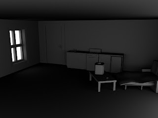
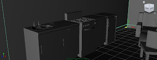
Above images show the rough layout of the bedsit flat. I opted for a sofabed rather than a proper double or single bed because I felt it would help to illustrate a theme of impoverishment and also quickly convey the lack of space and multiple functionality that the room must have as a result. The coffee table is pulled right over to the sofabed to suggest that this is where the character would spend all of his time, plonked in front of the tv. The kitchen area is based off the visual research into small bedsit kitchenette areas often found in small enclosed spaces. Decided to go for an old fashioned style of gas cooker as I felt this would again enhance the theme of poverty as nothing in the flat i high tech or particularly pretty to look at.

With the general layout and main frame of the flat laid out, I can now go back and add in more assets and think about lights and textures.