Saturday, 11 May 2013

11.05.13 Refining the lighting in the Nursery scenes

So while I was updating the textures in the nursery scenes, creating higher resolution colour and bump maps, I started trying to revise the lighting setups I had already and looked at how I could improve them.

Luckily, it was pretty sunny today, so I had a jaunt about my flat and took some pictures as reference for how the sunlight would be cast across the room and the shadows it would throw, and how they varied.


Here I was looking at how the sunlight affected different materials. Paying attention to the bounce of light off the gloss painted door, in comparison to the less reflective wall.


Here (excuse the mess....) I was looking at how light travels and bounces around corners to light up the room, and get into the corners. On a really sunny day like today, and like the one I intended to portray in my "Constructing" and "Constructed" version of the nursery scene, there shouldn't be any vary dark shadowed areas, not even in the corners of the room.


Again looking at how the sunlight reacted on the wall, in comparison to the wardrobe.


Sun decided to hide behind a cloud at this point...


Looking at colour bounce and reflections


Looking at how the direct rays of sunlight filter through the window and the shadows they cast, and how intense the light would be.


Looking at the dropoff and angles which the sunlight travels in and how it lights up the room and casts the shadows from the objects on the windowsill.


Went into the very messy living room to get a look at how the sunlight interacts with other materials and surfaces, and the various shadows it casts, how dark they are, and how soft the edges are when compared with direct sunlight, and light bounce.


Looking at how sunlight falls across fabric, and bounces off the reflective wooden floor.


The shapes the shadows have formed as a result of how light is cast around the objects on the windowsill and table. 


Lighting the Nursery (take 2) "Construction", Happy/Expectant/Excited


This is the original lighting from the "Constructing" Scene. There are far too many dark shadows for it to emulate a "happy/excited" state of mind. The lighting in the centre with theglowing bulb is far too intense and the floor and dust sheet are too dark. The research into natural sunlight and how it falls across an interior space really helped me pick this apart because it's way more obvious now than it ever was.


Got an image plane for the outside of the window so it's not just a blue environment. The lighting on the ceiling is still too intense but the shading going on around the floor and dust sheet is better. I still think the shadows in the corners are too dark though. The light intensity cast through the window from the spotlamp creates a nice light on the dust sheet on the floor.


Trying to get some shadows going from the sunlight coming in the window. These are too soft to really be representative of the type of shadows cast from sunlight which tend to have much crisper edges when in the direct path. These look more like shadows from a bounced light. Took out the light source coming from the bulb, as if the room is brimming with sunlight, the bulb wouldn't be on anyway. Applied a simple glass shader to the bare bulb.


Oops. Increased the intensity of the volume light far too much.


After decreasing the intensity I've lost all my shadows and I've got this weird line of brightness going around the middle of my scene :/


Decreased the intensity again but now it's too dull and I still have that annoying line in the middle. Aso now got a circular light shape casting on the door which I don't want...


Got my shadows back on, casting from the main volume light in the center of the room. But the shadows are too dark and are going in the wrong direction I want them to.


Took shadows off from the main volume light and tried to cast them from a directional light which had it's intensity set to 0. This had no effect..... I also now have a weird falloff shape from the spotlamp coming in the window to simulate sunlight, this is because I changed the angle slightly. Increasing the penumbra angle should sort this out.


Ok so went back to having th shadows cast from the main volume light in the scene, but again the shadows are going in all sorts of different directions and are too dark. Changed the angle of the sunlight spotlamp so some of the intense light cast through the window would fall onto the floor, as it looked like it was lining up with the dust sheet too much earlier.


Changed the shadow colour. This tone looks a bit better, but in terms of conveying the happy/expectant/excited frame of mind of the character's painting this nursary, having big long looming shadows doesn't really do well to show this. So the need to look less threatening.


Softened the raytraced shadows by increasing the light radius, and brought the tone up again. Moved the volume light nearer the window to get the shadows casting the way I want, but the ladder still has a really distracting, looming shadow. And the shadow cast from the ceiling light is too crisp for a shadow cast in that direction from natural sunlight. The "sun's" rays are aimed in at an angle towards the floor so any shadows cast on the ceiling would be secondary due to light bouncing off the surfaces, and not nearly as dark or as clear as that. 


Moved the shadow casting volume light higher to make the shadows cast downwards and create a less threatening "loomy" shadow. However moving the volume light around to get the shadows right means I'm now getting much darker areas away from the window, and the contrast is too great from one side of the room to the other to be consistent with natural sunlight, and does nothing to illustrate the themes and state of mind I'm trying to show. I also now have this annoying light at the ceiling near the window due to moving the volume light up. If I duplicate the volume light in this position and have the duplicate only casting shadows, while moving the original volume light down and in nearer the middle of the room and turning shadows off, this MIGHT just fix the issue...


Yeah so that didn't work at all....I went in and rendered it again after unchecking the "emit ambient" box on the shadow casting light on the offchance it was doing something silly...noopeee...


Increased intensity to 700 on second volume light in hopes this would make the shadows work. Every other setting is the same from the other volume light when the shadows were working so I don't really understand why it's decided to not cast the shadows now..... It does however create a better lightcast on the white "reflective" crib box. (reflective as in that the tone white reflects light, not that the material or texture are reflective." But the intensity of the light means I have again got this weird glow on my ceiling.


Turns out the two volume lights were sorta canceling each other out and they both need to be emitting ambience and shadows for it to work at all. At least that's my understanding of it..
Now the shadows are casting thanks to the two volume lights. But now I have a weird light thing going on near the ladder shadow at the back right hand corner...


Ok. I think this is coming along a lot better. The shadows are casting in a much better colour and they aren't as oppressive or threatening as before. The volume light nearer the window is casting a good level of intensity on the white cardboard box, which thanks to my day of running around the flat snapping up photos of sunlight interacting with materials and textures, looks to be alright. The light it's casting on the ceiling is diffusing nicely across in tandem with the light direction and sun rays. A few more tweaks should do it. (hopefully)

Rendering out in a HD format, so I can then scale the render down and get rid of any imperfections as an anti-aliasing trick.

Friday, 10 May 2013

Drug Abuse Scene - crit

So the aim of this particular environment was to convey the themes of depression, hopelessness, impoverishment and drug dependence, and illustrate similar state of mind through the practical implementation of this critical framework.

Ambient Techniques
Colour
Lighting
Materials/Textures
Space
Framing
Geography
Architecture
Narrative Techniques
Player Created Scenes
Scenes
Events
Vignettes


Props
Artifacts
Decals
Effects
Posters
Graffiti
Navigational Techniques
Beacon
Signpost
Trail


Ambient Techniques:

Colour:

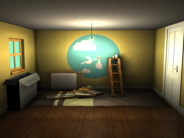
All the colouring in this scene is kept fairly neutral. (see below). There are no really bright or bold colours, and the colour pallette is formed mainly of browns and dull muddy yellows. This is to reflect the mental state of mind of the character as they colours are unpleasant tones to look at and convey a sense of poverty and a tone of depression.


Lighting:
The lighting in this scene is kept predominantly dull (above) , with lots of soft, creeping shadows. This is to again enforce the idea of depression and to reflect the degenerative psychological state of the character as the lack of bright lighting implies a lack of joy or happiness in their life.


Materials/Textures:All of the textures in the scene have some manner of dirt or stains on them. This is to imply that the character is so far gone in their depression that they no longer care about the state of their surroundings, or that they are perhaps so hooked on drugs and constantly out of it so they don't really notice the deteriorating state of the environment, much like they wouldn't realise the deteriorating state of mind as a result of drug abuse.

Space/Framing:
There isn't much space in the flat. Everything is cramped into one room in the style of a bedsit. This helps to quickly convey a sense of poverty and implies that the flat is all the character can afford, and was selected for nessessity rather than choice.


Geography:The blinds are drawn on the flat windows so you don't get a sense of where it is or what's outside. This is deliberate in order to convey the trapped feeling the character will have as they are locked in a downward spiral of drug abuse.


Architecture:The small, cramped bedsit is typical of old fashioned homes which often had whole families living in the one room. Again this helps to quickly convey the idea of poverty.

Props;
Artifacts:The objects on the coffee table include a range of drug paraphernalia such as a bag of heroin, a hash pipe, a hash grinder with weed inside it, a spoon for melting the heroin, and an ashtray which appears to be full of ash and cigarettes. In addition there are also bottles of beer dotted about the table. All of these props point towards a drug problem, and a penchant for substance abuse.


Decals:Decals are "splatter textures" which are normally produced as a result of the players actions. As this project isn't an interactive one, there are no decals per say.

Effects:
There are no effects in the scene, as they are not required.

Posters:
While there are no posters in this scene, the "economy" branding of the food products could be considered as "poster" as the branding represents an institution. The institution in this case would be economy food ranges and this in turn helps to convey the idea of poverty and ties in with the depression state of mind.


Graffiti:
There is no graffiti in this scene.

Narrative Techniques.Player Created Scenes/ Events/ Vignettes:
Again, as this is not a spatial interactive project, these categories do not apply. The environment would be classed as a Scene in which there is evidence of an event/various events which the player was not witness to, these events in this case would be the progressive deterioration of the environment and the state of mind of the character.


Navigational Techniques

Beacon:
The main light sources act as beacons in this scene, drawing the eye to the kitchen area where there are countless stacked dirty dishes, and filthy work surfaces. The cooker is covered in stains and ground-in dirt, showing that it has long since been neglected. The TV set also acts as a beacon with it's light source, drawing the player's eye to other important details - the drug paraphernalia which lie on the coffee table.

Signpost:

As it is such a dark scene, the lighting here acts as a signpost. Not only as a directional beacon but to highlight areas/artifacts of particular importance.


Trails:
Smaller artifacts such as the props on the coffee table and the scattered dishes in the kitchen serve as a trail, all leading towards the sofabed and tv area as the main focal point of the room.

Thursday, 9 May 2013

09.05.13 Let there be light, sorta

So started trying to get the lighting sorted properly for the flat. It can't be too bright because it has to generate a feeling of oppressiveness and depression, but it has to be bright enough so that you can actually see the colours and props and assets which all come together to really showcase the depressed, drug dependent state of mind of the impoverished character who lives here.

First I made a tiled splashback for the kitchen area, since I realised it looked pretty odd without one.
The lighting so far is pretty dark. The only real light sources in the scene will be the light coming from the ceiling light above the kitchen area, and the light cast from the TV screen. As it's set during the day (since Jeremy Kyle will be on the TV) I'll need to have a bit of daylight around the drawn down blinds at the window.

Started trying out different lighting techniques around the kitchen area.


Using point lights, and a volume light dropoff from the living room area. Wayy too dark. You can't even see the surfaces properly
And again.


Switched to using a SpotLight. The falloff is too far and looks weird.


Again with both lights.

This lighting looks a bit better with 2 spotlamps. Too bright though.


Increased the penumbra angle to get a softer edge on the lights. Got a third spotlamp in the middle there, though I originally wanted only two to create the effect that the middle bulb had blown out and hadn't been replaced. However, reducing the intensity of the middle spotlamp can still make it look like one of the bulbs has blown out, without having to sacrifice lighting on the surface space, which is a bonus. It's still a bit too bright though.


I think this is looking better. It's dark enough to look pretty dim, dingy and depressing, but light enough to show the props on the surfaces. The dirt on the wall shows up pretty well with this lighting setup too.


Wednesday, 8 May 2013

08.05.13 Jezza in the House/Flat (?)


Not entirely sure if I'll get away with this but it is highly relevant. Got a screencap of The Jeremy Kyle show as the texture for the TV screen. Everyone and their dog knows that Jeremy Kyle is a daytime show about folk who have ridiculously bizarre problems in their life and choose to go on national television in order to sort it out, sometimes with those all important DNA/Lie detector tests!

So in theory, this shows that the character who lives in this hovel in in during the daytime most days, which should tell the audience/player that they are unemployed and as such, impoverished due to their drug habit eating away all of their benefits. Shame. Yet to see if I'm actually allowed to use this texture seeing as its an image which is from a TV show, but I think as long as I reference it properly it should be alright.
In addition to that I think I've finally got the tv plastic material looking how I want it, thanks to spending hours changing the blinn material settings and adding a high res noise bump map and spending more time adjusting the values layered on to that.


Friday, 3 May 2013

03.05.13 Revisiting the nursery scene.

So went back to one of the first scenes after making all this progress with my junkie flat to find it woefully lacking. I don't know what I thought I had done to this but whatever it was it's definately not up to the scratch I thought it was. 
This is a render of the first scene as it's being constructed, taking the room through the three stages of Construction, Completion, and the final scene which shows the nursery after the death/stillbirth of the child, to show the changes a room goes through over time as a reflection on the psychological state of the family.


These clearly need more work on them than I originally thought, and this late in the game it's proving to be a bit of a disaster since I've spent more of my time on the drug abuse scene than anything else.

Going to be trawling through and updating the texture maps to higher resolution files as the corresponding bump maps just aren't good enough. The "completed" stage needs more assets thrown into it, like a vase of summery flowers and some products at the baby changing station.

The "after death" scene needs to feel more emotive as right now there's just a few charity boxes scattered about and they don't really mean anything. I'm going to get stuck in and try and update this while carrying on with the textures for the drug abuse scene. At this rate I'm sitting with these four scenes and the Happy/Content scene is still just a mass of geometry, half mapped and with no textures and no real development for direction. I might have to make a judgement call and scrap that scene and just carry on with these ones. I think that if I can illustrate the theme of Happy/content/excitement/expectation in the first two nursery scenes then the Happy/Contented couple scene on it's own would be pretty redundant anyway. At this stage it's all about time management and prioritisingto make sure the scenes I have are conveying the correct themes and states of mind.