Old lighting;
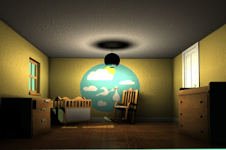
The lighting here is very mucked up. The shadow cast on the ceiling for one thing is ridiculous and the shadow around the top of the lampshade just isn't right. Again, shadows on the geometry closest to the camera is far too dark, and the shadows on the rocking chair and constructed crib are too soft to be consistent with shadows cast as a result of sunlight. Major revisions needed here.

Softened out the shadows, but there are too many being cast for the singular sunlight light source. It has to look like the sunlight coming through the window is the only form of light in the scene, and not that I have other volume and directional lights so the soft shadows on the wall have to go.

Again, shadows are too soft and in the wrong direction thanks to the volume light.

Decided to "improve" the caustic and photon settings and ended up with this. It looks like there's a discoball casting loads of red lights all over this place. This isn't right. Not to mention the ultramegacrazy intense lighting at the ceiling. And don't even get me started on what's happening with the non-textured lampshade...and the horrible line of light around the top of the room. horrific.


Again, adjusting the colouring of the room lighting to make it a bit brighter and justify not using the main ceiling light as it's not required. Shadows still need sorting.

Started trying out lighting with volumertrics to simulated a sunlit room with dust particles. Not going to plan so far.

Yeah, it's just making it look really washed out. Need to make it interact with the lighting properly.

Looking super foggy more than anything else.

Feels like I'm looking through a dirty window. which would be cool if thats the effect I was trying to replicate... Shadows again I have morphed into looming monsters. Yeah volumetric lighting just isn't giving me the effects I need, and it's reacting weird with the photons. Will need to sort this.

Taken the lightfog effect out because it's just not having the effect I want at all. Now I'm left with this, and an odd distribution of photons which seem to be picking up the floor colour and bouncing it onto the left face of the crib light a mini red spotlamp. Not ideal!

Sorted out the photon issue. Back to soft loomy shadows and washed out lighting...

Another view to see how the light is falling. Volume light boundary at the top of the wall is too obvious and will need to be softened. Got in image plan in behind the window.

Washed out, daft shadows, image plan vanished...

Where fort art thou image plain?! And the light boundaries are awful. sdjkfhsdk

Was rending through the wrong camera, D'oh. Image plain back! Light fog reduced density and now reacting with the spotlamp as a proper ray of light but it's too thin and condensed.

Took out the light fog. Need to find a way of brightening the environment image plain as it's looking far too dark in comparison, and making this look like more of a weird moonlight scene.

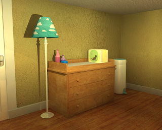
A view of the changing station. Just to test materials. the nappies packaging is too reflective.

Made a new camera and sorted out the photons and light fog. This is moe the type of lighting I'm looking for. Bright, sunny colours to reflect the blissful state of mind of the happily expectant couple. Still got some shadow issues, but this colouring is much better.

Trying to get the shadows to cast the way I want, lots of moving lights about.

Moved the volume light too far away and it's creating too much of a contrast between the lightest areas in the room and the darkest. A sunny room with bright colours wouldn't have such dark areas.

Brightened it up a bit. Volume light still casting that horrible light boundary.

Shadows need more work.

Lighting doesn't work so well for this side of the room, got the spotlght eadges too clearly visable and the shadows aren't raytracing behind the light and props....

Now the shadows work, but its far too dark, and reacting weird at the bottom of the lamp, it looks more like a gradient...

Here the shadows are far too soft and blurred and cutting off because of the new angle for the spotlight. Not working!!

Again, shadow colour set too light and the light is bouncing about off the reflective nappy packaging and the plastic nappy bin in the corner.

Back to basics. Better lighting but with no shadows...

Same shadow colour problem, looks fine with the volume light but in the light cast by the sunlight spotlight the shadows become brighter than the materials they are falling on.

Darker here with no shadows. Fixing the textures reflectivity.

This is just all kinds of wrong.
Looking better here but still having that issue with the lamp shadow at the base. This is probably due to the reflectivity of the skirting board.

Not bad bright lighting, the colour bounce on the ceiling needs looked at though, and the shadows around the rocking chair.

Shadows are too dark by comparison now.

Moved the volume light and that as definately not a good move. Shadows are wayyy too stretched out, look at the lampshade shadow on the ceiling :|
Also the rocking chair shadow has morphed into a monster again.

Looking too bright around the lampshade area on the ceiling.

Changed the angle of the sunlight spotlight coming through the window so the light encapsulates the rocking chair too, drawing more attention to it and casting more shadows on the floor.

Rotated the volume light direction down an axis to try and cast better shadows. This was an obvious fail.

Back to normal. Slightly brighter.

Moved the volume light up to try and cast better shadows. But the shadows cast are having that weirdo gradient lighter problem again.

Moving it around to try and get a better direction for the shadows to cast from.

Got some blinds on the window. And softened the edges of the volume light which is responsible for keeping the room as bright as it is. Got another volume light in at the window to simulate the light bounce near teh area, which is consistent with my visual research a few days ago into how sunlight enters and filters through a room. Just need to tweak a a bit of the render settings and set up cameras to render the main points of interest to illustrate the key features that pull together to convey the state of mind in this stage.
No comments:
Post a Comment