Throughout semester 2 it has been my
goal to improve my Texturing, Uv Mapping, Lighting and Modelling
skills.
In semester 1 my project aim was to convey a sense of character through the environment. Although this aim changed, the environment room I created for the character is a good example of where my skill level was sitting at before taking a more focused look into theses three particular areas.
Even looking at previous work throughout my 4 years at university I would say that focusing on this now without having the distractions of having to think about also rigging, animating etc on top of the modelling texturing and lighting, this has enabled me to improve.
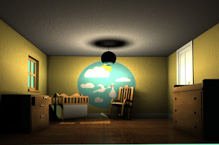
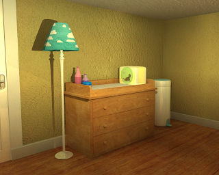
So in Semester 1, this was the type of work I was producing;
In semester 1 my project aim was to convey a sense of character through the environment. Although this aim changed, the environment room I created for the character is a good example of where my skill level was sitting at before taking a more focused look into theses three particular areas.
Even looking at previous work throughout my 4 years at university I would say that focusing on this now without having the distractions of having to think about also rigging, animating etc on top of the modelling texturing and lighting, this has enabled me to improve.
So in Semester 1, this was the type of work I was producing;


The models are pretty basic in terms of form, and it always seemed to take me forever to model anything as I always tended to find the most lengthy and problem-strewn way of doing anything. The textures are really simple and a bit too cartoon-esque for my liking. (the mushroom for example, though based off of game merchandise, shouldn't look quite so out of place as it does).
My lighting skills were also woefully
lacking due to never really paying much attention to lighting design
before, having always been focused on characters and animation, or
purely using lighting just to give light to a scene, and not really
think about what that lighting design might imply, or the atmosphere
it might create.
Uv Mapping was also a big problem area
for me as I could never really get my head around exactly how to
unwrap a 3D object properly, and how best to place the seams for
proper texture alignment. I just couldn't understand it. Problem
solving like this was never my speciality and difficulty visualising
the “net” shape of an object was a problem I had since way back
in high school maths.
Texturing was something I always gave a sort of half-hearted effort into. I figured if I could source photos from the internet and fire them onto my models then how much thought did I really have to give it? Loads actually. As you can see from the toon style, that was pretty much how I worked in photoshop, basic block colouring over simple, low res UV maps. My own personal style of drawing just wasn't going to cut it with any kind of environment scene I would make unless I made it all with a toon shader, so texturing was definitely something I had to look in to improving and researching, and expanding my personal style.
Texturing was something I always gave a sort of half-hearted effort into. I figured if I could source photos from the internet and fire them onto my models then how much thought did I really have to give it? Loads actually. As you can see from the toon style, that was pretty much how I worked in photoshop, basic block colouring over simple, low res UV maps. My own personal style of drawing just wasn't going to cut it with any kind of environment scene I would make unless I made it all with a toon shader, so texturing was definitely something I had to look in to improving and researching, and expanding my personal style.


Starting off with modelling. Really it
was all about practice, practice and more practice. I hadn't really
looked at or even touched maya all summer so my working knowledge had
again become rusty. Through just ploughing on and looking up
tutorials whenever I ran into particular issues, I really feel that
my modelling ability has improved. I feel much more confident when I
think about tackling a 3D object and though at first I might need to
sit and try and visualise a particular approach, I find this is
better than just starting off blindly and spending hours trying to
figure out the right way to model something. That was always my
problem with maya, there were always too many ways of doing
something. I like to know that there is a right way, or a best way,
but it seemed like each time I looked up a particular way of
approaching modelling an object, there were always so many different
suggestions and opinions on the tutorial forums. This always
frustrated me as I like to have it clear in my head that I am doing
something the definite right way, but with so many options and
personal approaches, I would always worry that there was a better
way.
Time constraints and management for the honours project meant I just pushed these thoughts away and tried to find the best way that worked for me, and stopped sitting worrying about all the other stuff and just ploughed on and got things done. I found just getting on with things instead of sitting worrying about other ways definitely helped because I could find my own approach and grow more comfortable with it, and improve my modelling speed as a result.
Time constraints and management for the honours project meant I just pushed these thoughts away and tried to find the best way that worked for me, and stopped sitting worrying about all the other stuff and just ploughed on and got things done. I found just getting on with things instead of sitting worrying about other ways definitely helped because I could find my own approach and grow more comfortable with it, and improve my modelling speed as a result.
Similarly for UV mapping, the more I did it, the easier it became and the faster I could map objects. Tricks which should have been obvious to me years ago, I picked up on thanks to tutorials and some texturing books....such as instancing objects so when I changed the texture on one I wouldn't have to go through and manually change everything, and mapping half of an object then mirroring the mesh over, combining it and sewing up the edges in the UV map before exporting out to paint in photoshop. Like I said, silly things like this which I should have picked up on before, spending more time focused on this has allowed me to finally get to grips with it.


To improve on texturing, I had a look
at various book and tried out a few of the step by step tutorials on
how to replicate materials such as glass, plastic, metal etc. These
books were particularly handy because they didn't just give you a
list of settings to type in and be done with it, they explained the
properties of the material and why it interacted with light the way
it did. Understanding the way a material should interact with the
light and taking a more in depth look / analysis into that material
through visual research really helps to understand what the settings
actually mean in maya and helps towards understanding and producing
other shaders. My photoshop ability improved also. Having mainly
worked in Illustator before, I wasn't too confident with photoshop
and found it difficult to understand where my texture was going on
the UV maps, though that was mainly because of my poorly mapped
objects. I also spent a bit of time learning how to create custom
brushes and textures, which would prove greatly useful for my drug
abuse scene in which I had to layer dirt and stains over practically
every object material in the scene. Having various brushes I could
re-use greatly improved my texturing workflow.


Lighting is something I always considered to be last minute, not very important. How wrong was I. The light in a scene can completely change the entire atmosphere, and it's not just about brightening the scene enough to see the props etc. How I overlooked this so much before, I'll never know. It was the tediousness of it which put me off, and how changing one little setting or slider could completely make or break a scene. There didn't seem to be an in-between.


Researching films and games which rely heavily on lighting really enforced upon me just how monumentally important lighting is. My skills however were woefully lacking in that respect. I completed a fair few lighting tutorials and experimented with different light types and finally learned what all the different settings in lighting actually mean. Before I just changed settings a bit and crossed my fingers while it rendered out, which is idiotic to say the least. This semester I finally got to grips with the settings and learned what they actually meant. So now instead of changing just any setting and hoping it works then tearing my hair out when it doesn't, I learned the different properties of the Diffuse, Penumbra, light radius (shadows) etc so I would actually know what was wrong with the lighting in a scene and which setting to go to in order to fix it instead of blindly moving sliders and typing in values. Again this will seem like basic common knowledge but before this project it was always something that tended to and didn't seem all that important, as long as the light was the right colour and intensity to light up the scene. Wrong approach. Similarly with shadows, I had no working knowledge of depth map shadows or how to make shadows appear softer. Lighting tutorials again sorted this out and some visual research into how different lights cast different types of shadows, and how soft lighting is achieved. All in all, I would say that I have managed to improve the skills I set out to throughout this semester.