For the first time in ages, today I woke up feeling somewhat....inspired. It's been a while since I've even been able to think about doing anything productive in my freetime since uni has finished - it took a lot out me towards the end, namely my soul.
Anyway today I've been playing about with a couple of ideas for a little something-something and I've just finished writing up a GDD for it. Thought I'd revisit this blog and document the progress I make on this little project and also I think by posting things like this out into the world it might motivate me to keep up whatever it is that I'm doing.
Hopefully I'll be able to keep up some momentum and this won't end up being another wee project that falls by the wayside.
More updates soon :)
EndOfLine
4th Year Honours Blog for Laura McSheffrey
Wednesday, 14 August 2013
Sunday, 12 May 2013
Reflective Summary
Throughout semester 2 it has been my
goal to improve my Texturing, Uv Mapping, Lighting and Modelling
skills.
In semester 1 my project aim was to convey a sense of character through the environment. Although this aim changed, the environment room I created for the character is a good example of where my skill level was sitting at before taking a more focused look into theses three particular areas.
Even looking at previous work throughout my 4 years at university I would say that focusing on this now without having the distractions of having to think about also rigging, animating etc on top of the modelling texturing and lighting, this has enabled me to improve.
So in Semester 1, this was the type of work I was producing;
The models are pretty basic in terms of form, and it always seemed to take me forever to model anything as I always tended to find the most lengthy and problem-strewn way of doing anything. The textures are really simple and a bit too cartoon-esque for my liking. (the mushroom for example, though based off of game merchandise, shouldn't look quite so out of place as it does).
My lighting skills were also woefully
lacking due to never really paying much attention to lighting design
before, having always been focused on characters and animation, or
purely using lighting just to give light to a scene, and not really
think about what that lighting design might imply, or the atmosphere
it might create.
Uv Mapping was also a big problem area
for me as I could never really get my head around exactly how to
unwrap a 3D object properly, and how best to place the seams for
proper texture alignment. I just couldn't understand it. Problem
solving like this was never my speciality and difficulty visualising
the “net” shape of an object was a problem I had since way back
in high school maths.
Texturing was something I always gave a sort of half-hearted effort into. I figured if I could source photos from the internet and fire them onto my models then how much thought did I really have to give it? Loads actually. As you can see from the toon style, that was pretty much how I worked in photoshop, basic block colouring over simple, low res UV maps. My own personal style of drawing just wasn't going to cut it with any kind of environment scene I would make unless I made it all with a toon shader, so texturing was definitely something I had to look in to improving and researching, and expanding my personal style.
Texturing was something I always gave a sort of half-hearted effort into. I figured if I could source photos from the internet and fire them onto my models then how much thought did I really have to give it? Loads actually. As you can see from the toon style, that was pretty much how I worked in photoshop, basic block colouring over simple, low res UV maps. My own personal style of drawing just wasn't going to cut it with any kind of environment scene I would make unless I made it all with a toon shader, so texturing was definitely something I had to look in to improving and researching, and expanding my personal style.
Starting off with modelling. Really it
was all about practice, practice and more practice. I hadn't really
looked at or even touched maya all summer so my working knowledge had
again become rusty. Through just ploughing on and looking up
tutorials whenever I ran into particular issues, I really feel that
my modelling ability has improved. I feel much more confident when I
think about tackling a 3D object and though at first I might need to
sit and try and visualise a particular approach, I find this is
better than just starting off blindly and spending hours trying to
figure out the right way to model something. That was always my
problem with maya, there were always too many ways of doing
something. I like to know that there is a right way, or a best way,
but it seemed like each time I looked up a particular way of
approaching modelling an object, there were always so many different
suggestions and opinions on the tutorial forums. This always
frustrated me as I like to have it clear in my head that I am doing
something the definite right way, but with so many options and
personal approaches, I would always worry that there was a better
way.
Time constraints and management for the honours project meant I just pushed these thoughts away and tried to find the best way that worked for me, and stopped sitting worrying about all the other stuff and just ploughed on and got things done. I found just getting on with things instead of sitting worrying about other ways definitely helped because I could find my own approach and grow more comfortable with it, and improve my modelling speed as a result.
Time constraints and management for the honours project meant I just pushed these thoughts away and tried to find the best way that worked for me, and stopped sitting worrying about all the other stuff and just ploughed on and got things done. I found just getting on with things instead of sitting worrying about other ways definitely helped because I could find my own approach and grow more comfortable with it, and improve my modelling speed as a result.
Similarly for UV mapping, the more I did it, the easier it became and the faster I could map objects. Tricks which should have been obvious to me years ago, I picked up on thanks to tutorials and some texturing books....such as instancing objects so when I changed the texture on one I wouldn't have to go through and manually change everything, and mapping half of an object then mirroring the mesh over, combining it and sewing up the edges in the UV map before exporting out to paint in photoshop. Like I said, silly things like this which I should have picked up on before, spending more time focused on this has allowed me to finally get to grips with it.
To improve on texturing, I had a look
at various book and tried out a few of the step by step tutorials on
how to replicate materials such as glass, plastic, metal etc. These
books were particularly handy because they didn't just give you a
list of settings to type in and be done with it, they explained the
properties of the material and why it interacted with light the way
it did. Understanding the way a material should interact with the
light and taking a more in depth look / analysis into that material
through visual research really helps to understand what the settings
actually mean in maya and helps towards understanding and producing
other shaders. My photoshop ability improved also. Having mainly
worked in Illustator before, I wasn't too confident with photoshop
and found it difficult to understand where my texture was going on
the UV maps, though that was mainly because of my poorly mapped
objects. I also spent a bit of time learning how to create custom
brushes and textures, which would prove greatly useful for my drug
abuse scene in which I had to layer dirt and stains over practically
every object material in the scene. Having various brushes I could
re-use greatly improved my texturing workflow.
Lighting is something I always considered to be last minute, not very important. How wrong was I. The light in a scene can completely change the entire atmosphere, and it's not just about brightening the scene enough to see the props etc. How I overlooked this so much before, I'll never know. It was the tediousness of it which put me off, and how changing one little setting or slider could completely make or break a scene. There didn't seem to be an in-between.
Researching films and games which rely heavily on lighting really enforced upon me just how monumentally important lighting is. My skills however were woefully lacking in that respect. I completed a fair few lighting tutorials and experimented with different light types and finally learned what all the different settings in lighting actually mean. Before I just changed settings a bit and crossed my fingers while it rendered out, which is idiotic to say the least. This semester I finally got to grips with the settings and learned what they actually meant. So now instead of changing just any setting and hoping it works then tearing my hair out when it doesn't, I learned the different properties of the Diffuse, Penumbra, light radius (shadows) etc so I would actually know what was wrong with the lighting in a scene and which setting to go to in order to fix it instead of blindly moving sliders and typing in values. Again this will seem like basic common knowledge but before this project it was always something that tended to and didn't seem all that important, as long as the light was the right colour and intensity to light up the scene. Wrong approach. Similarly with shadows, I had no working knowledge of depth map shadows or how to make shadows appear softer. Lighting tutorials again sorted this out and some visual research into how different lights cast different types of shadows, and how soft lighting is achieved. All in all, I would say that I have managed to improve the skills I set out to throughout this semester.
Lighting the Nursery "After Death" Stage. State of mind/ Themes: "Grief stricken/Loss/Depression/"
In this stage, the nursery is shown after an event in which the child is miscarried or stillborn. The purpose of this scene is to illustrate how a room can change over time and how mostly the same geometry can be rearranged and lit to convey a completely different mood, story, and state of mind.
This is the original lighting. Floor is too reflective and causing a light bounce from the volume light in the center of the room which is keeping everything from being completely black.
Toned down the brightness and updated the environment image plane shader. It's still too bright and doesn't really emanate grief at all. It might as well be representative of a family moving in to a new house.
Moved the teddy bear from teh crib to the rocking chair, to imply that there is no need for it to be in the crib as there is no child. Having his body slumped and head keeling back over the arm is to imitate an exhaustive posture and imply the psychological exhaustion the parents are feeling as they deal with the overwhelming grief and depression of loosing a child.
Darker room with soft shaders cast in a number of directions. The more shadows there are, the more oppressive the environment becomes, therefore I think it would be a good idea to have a few looming shadows going in some slightly different directions. The blinds have been drawn down here also, but having a bit of light from outside show around them would be an effective way at suggesting that even though it's daylight outside, the blinds have been drawn to shut out the light to represent that the parent's are shutting out the world in the grief-stricken state of mind.
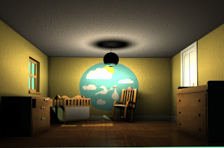
Lighing the Nursery "Constructed"
This is the second stage of this scene, which shows the finished nursery and should showcase the happy/excited/blissful state of mind of the expectant couple.
Old lighting;

Softened out the shadows, but there are too many being cast for the singular sunlight light source. It has to look like the sunlight coming through the window is the only form of light in the scene, and not that I have other volume and directional lights so the soft shadows on the wall have to go.
Again, shadows are too soft and in the wrong direction thanks to the volume light.
Decided to "improve" the caustic and photon settings and ended up with this. It looks like there's a discoball casting loads of red lights all over this place. This isn't right. Not to mention the ultramegacrazy intense lighting at the ceiling. And don't even get me started on what's happening with the non-textured lampshade...and the horrible line of light around the top of the room. horrific.
Calmed down those crazy photons. The light on the ceiling will have to go as you wouldn't have a light on in a room when there is sunlight streaming in, would you? Think of the planet. Shadows from the rocking chair and crib are still too soft.
Started trying out lighting with volumertrics to simulated a sunlit room with dust particles. Not going to plan so far.
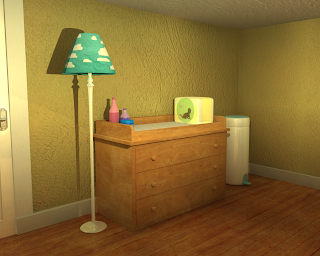
A view of the changing station. Just to test materials. the nappies packaging is too reflective.
Here the shadows are far too soft and blurred and cutting off because of the new angle for the spotlight. Not working!!
Again, shadow colour set too light and the light is bouncing about off the reflective nappy packaging and the plastic nappy bin in the corner.
Back to basics. Better lighting but with no shadows...
Same shadow colour problem, looks fine with the volume light but in the light cast by the sunlight spotlight the shadows become brighter than the materials they are falling on.

Not bad bright lighting, the colour bounce on the ceiling needs looked at though, and the shadows around the rocking chair.
Changed the angle of the sunlight spotlight coming through the window so the light encapsulates the rocking chair too, drawing more attention to it and casting more shadows on the floor.
Old lighting;

The lighting here is very mucked up. The shadow cast on the ceiling for one thing is ridiculous and the shadow around the top of the lampshade just isn't right. Again, shadows on the geometry closest to the camera is far too dark, and the shadows on the rocking chair and constructed crib are too soft to be consistent with shadows cast as a result of sunlight. Major revisions needed here.
Softened out the shadows, but there are too many being cast for the singular sunlight light source. It has to look like the sunlight coming through the window is the only form of light in the scene, and not that I have other volume and directional lights so the soft shadows on the wall have to go.
Again, shadows are too soft and in the wrong direction thanks to the volume light.
Decided to "improve" the caustic and photon settings and ended up with this. It looks like there's a discoball casting loads of red lights all over this place. This isn't right. Not to mention the ultramegacrazy intense lighting at the ceiling. And don't even get me started on what's happening with the non-textured lampshade...and the horrible line of light around the top of the room. horrific.
Calmed down those crazy photons. The light on the ceiling will have to go as you wouldn't have a light on in a room when there is sunlight streaming in, would you? Think of the planet. Shadows from the rocking chair and crib are still too soft.
Again, adjusting the colouring of the room lighting to make it a bit brighter and justify not using the main ceiling light as it's not required. Shadows still need sorting.
Started trying out lighting with volumertrics to simulated a sunlit room with dust particles. Not going to plan so far.
Yeah, it's just making it look really washed out. Need to make it interact with the lighting properly.
Looking super foggy more than anything else.
Feels like I'm looking through a dirty window. which would be cool if thats the effect I was trying to replicate... Shadows again I have morphed into looming monsters. Yeah volumetric lighting just isn't giving me the effects I need, and it's reacting weird with the photons. Will need to sort this.
Taken the lightfog effect out because it's just not having the effect I want at all. Now I'm left with this, and an odd distribution of photons which seem to be picking up the floor colour and bouncing it onto the left face of the crib light a mini red spotlamp. Not ideal!
Sorted out the photon issue. Back to soft loomy shadows and washed out lighting...
Another view to see how the light is falling. Volume light boundary at the top of the wall is too obvious and will need to be softened. Got in image plan in behind the window.
Washed out, daft shadows, image plan vanished...
Where fort art thou image plain?! And the light boundaries are awful. sdjkfhsdk
Was rending through the wrong camera, D'oh. Image plain back! Light fog reduced density and now reacting with the spotlamp as a proper ray of light but it's too thin and condensed.
Took out the light fog. Need to find a way of brightening the environment image plain as it's looking far too dark in comparison, and making this look like more of a weird moonlight scene.
A view of the changing station. Just to test materials. the nappies packaging is too reflective.
Made a new camera and sorted out the photons and light fog. This is moe the type of lighting I'm looking for. Bright, sunny colours to reflect the blissful state of mind of the happily expectant couple. Still got some shadow issues, but this colouring is much better.
Trying to get the shadows to cast the way I want, lots of moving lights about.
Moved the volume light too far away and it's creating too much of a contrast between the lightest areas in the room and the darkest. A sunny room with bright colours wouldn't have such dark areas.
Brightened it up a bit. Volume light still casting that horrible light boundary.
Shadows need more work.
Lighting doesn't work so well for this side of the room, got the spotlght eadges too clearly visable and the shadows aren't raytracing behind the light and props....
Now the shadows work, but its far too dark, and reacting weird at the bottom of the lamp, it looks more like a gradient...
Here the shadows are far too soft and blurred and cutting off because of the new angle for the spotlight. Not working!!
Again, shadow colour set too light and the light is bouncing about off the reflective nappy packaging and the plastic nappy bin in the corner.
Back to basics. Better lighting but with no shadows...
Same shadow colour problem, looks fine with the volume light but in the light cast by the sunlight spotlight the shadows become brighter than the materials they are falling on.
Darker here with no shadows. Fixing the textures reflectivity.
This is just all kinds of wrong.

Looking better here but still having that issue with the lamp shadow at the base. This is probably due to the reflectivity of the skirting board.
Not bad bright lighting, the colour bounce on the ceiling needs looked at though, and the shadows around the rocking chair.
Shadows are too dark by comparison now.
Moved the volume light and that as definately not a good move. Shadows are wayyy too stretched out, look at the lampshade shadow on the ceiling :|
Also the rocking chair shadow has morphed into a monster again.
Looking too bright around the lampshade area on the ceiling.
Changed the angle of the sunlight spotlight coming through the window so the light encapsulates the rocking chair too, drawing more attention to it and casting more shadows on the floor.
Rotated the volume light direction down an axis to try and cast better shadows. This was an obvious fail.
Back to normal. Slightly brighter.
Moved the volume light up to try and cast better shadows. But the shadows cast are having that weirdo gradient lighter problem again.
Moving it around to try and get a better direction for the shadows to cast from.
Got some blinds on the window. And softened the edges of the volume light which is responsible for keeping the room as bright as it is. Got another volume light in at the window to simulate the light bounce near teh area, which is consistent with my visual research a few days ago into how sunlight enters and filters through a room. Just need to tweak a a bit of the render settings and set up cameras to render the main points of interest to illustrate the key features that pull together to convey the state of mind in this stage.
Subscribe to:
Comments (Atom)


